
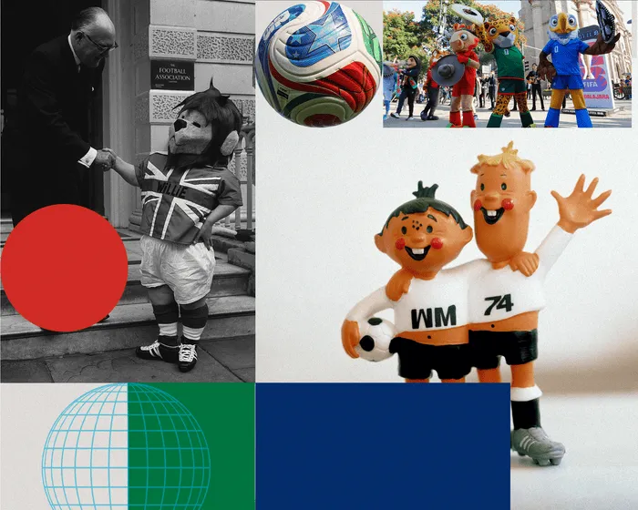
World Cup Willie burst onto the scene in 1966, showcasing a distinctive spiky hairstyle, a rebellious pose, oversized shoes, and, notably for a tournament held in England, a shirt adorned with the Union Jack. This creation sprang from a brief sketch by Reg Hoye, a children’s illustrator who later crafted a red devil mascot for Manchester United. Willie quickly became a marketing phenomenon, gracing everything from bed linens to beer mats and even ceramic items.
Fast forward six decades, and it’s evident how much the quality of World Cup mascots has deteriorated since their golden age in the 1970s and 80s. In 2026, we’re presented with the same uninspired formula that has dominated the past three decades: lifeless, corporate mascots resembling anthropomorphic animals. Introducing Canadian moose Maple, Mexican jaguar Zayu, and American bald eagle Clutch; they look more like characters that were cut from a mediocre animated sequel.
FIFA’s official site claims that Maple “combines endless stories and unstoppable flair,” which seems like the last thing one would expect from a moose playing goalkeeper. However, one cannot deny that his antlers might deter opponents from challenging him in the box. Clutch, on the other hand, is described as someone who “like all great midfielders, unites people wherever they go.” A nod to Roy Keane, perhaps?
Some might argue that only the intended audience should assess Maple, Zayu, and Clutch, but it’s worth noting that Willie wasn’t solely designed for children. After all, the merchandise in 1966 featured items like branded Wee Willie Cigars, car decorations, and lighters. Furthermore, not every mascot that followed was a hit; Juanito from Mexico’s 1970 tournament—a boy wearing a sombrero—was rather dull. However, the 1974 event brought a duo, Tip and Tap, who embodied the classic big and small character dynamic, reminiscent of a tactical strategy dreamt up by Pep Guardiola. Was Pep’s football philosophy influenced by these two? It’s hard to say, but it’s likely.
Argentina’s 1978 mascot, Gauchito, brought us a cheerful figure equipped with a whip and neckerchief, exuding the confidence of someone ready to outmaneuver a defender (let’s agree we probably won’t see another World Cup mascot wielding a whip). Following that was Spain’s 1982 entry, Naranjito, a giant orange conceived by graphic artists José María Martín Pacheco and Mariano Sedano, who certainly didn’t stray far from their Seville roots.
Naranjito’s simple yet effective design won hearts, leading to his own animated series, Fútbol en Acción, which featured friends like Clementina, a mandarin, Citronio, a hapless lemon, and Imarchi, a robot—because why not? The legendary Alfredo Di Stéfano also appeared in segments offering football tips to young viewers.
In contrast, 1986’s Pique stirred up debate in Mexico. This green chili pepper adorned with a sombrero and a long mustache was more colorful than its predecessor but faced criticism for reinforcing national stereotypes. A government official lamented, “It has nothing to do with the Mexico of today. It’s as if a group of gringos picked out a symbol to depict Mexico.” One of Pique’s creators, Segundo Pérez, defended the mascot by describing it as “a bit like the sleepy Indian taking a siesta against a tree,” a statement that may not have fully alleviated the controversy.
At least Ciao in 1990 sidestepped caricature, resembling a nightmarish Italian stick figure. Even FIFA’s own website concedes that this mascot is not “traditionally cuddly,” calling Ciao “the first and, to date, only mascot without a face.” The angular, football-headed figure was the brainchild of Lucio Boscardin, who conceived it while waiting at a traffic light—not, as one might expect, following a sleepless night of reading H.P. Lovecraft.
Post-Ciao, the quality began to plummet. It’s disheartening to realize that the decline of originality in World Cup mascots began in 1994, despite the U.S. being the home of sports mascots. Striker, a dog, was created solely to tap into the popularity of pets in America. This mundane canine offered nothing of value and set a dismal precedent for future mascots.
France’s 1998 mascot, Footix—a large blue rooster—did have a certain charm due to its appealing design. It is noteworthy as the only World Cup mascot to have offspring, as Footix’s daughter, Ettie, became the Women’s World Cup mascot in 2019. The 2002 tournament in Japan and South Korea produced a trio of aliens that somehow managed to be uninteresting, particularly when Ato, Kaz, and Nik were named in a vote held at McDonald’s and resembled something you’d be disappointed to find in a Kinder Egg.
Germany 2006 marked the last genuine effort for something unique with Goleo VI, a lion, and his talking ball, Pille. Despite being designed by the Jim Henson workshop, this duo was a significant flop. Goleo VI’s unsettlingly realistic appearance and the decision to make him trouserless caused public outrage. They were so unpopular that the Bavarian toy company that had acquired their rights went bankrupt before the tournament started.
Subsequent mascots followed a trend of uninspired designs: Zakumi, a leopard for South Africa 2010; Fuleco, an armadillo for Brazil 2014; and Zabivaka, a wolf for Russia 2018, whose ski goggles gave him an oddly Winter Olympics vibe. There’s some merit in Qatar 2022’s La’eeb, as a traditional Arab headdress provides a more interesting concept than yet another local wildlife mascot, despite its bland appearance reminiscent of Casper the Friendly Ghost.
Now, we find ourselves facing this year’s uninspired trio. It’s likely we’ll encounter another set of mascots for Morocco, Portugal, and Spain in 2030, but expectations for improvement are low. The era of memorable and charming World Cup mascots has faded into history, much like Willie’s World Cup cigars.


